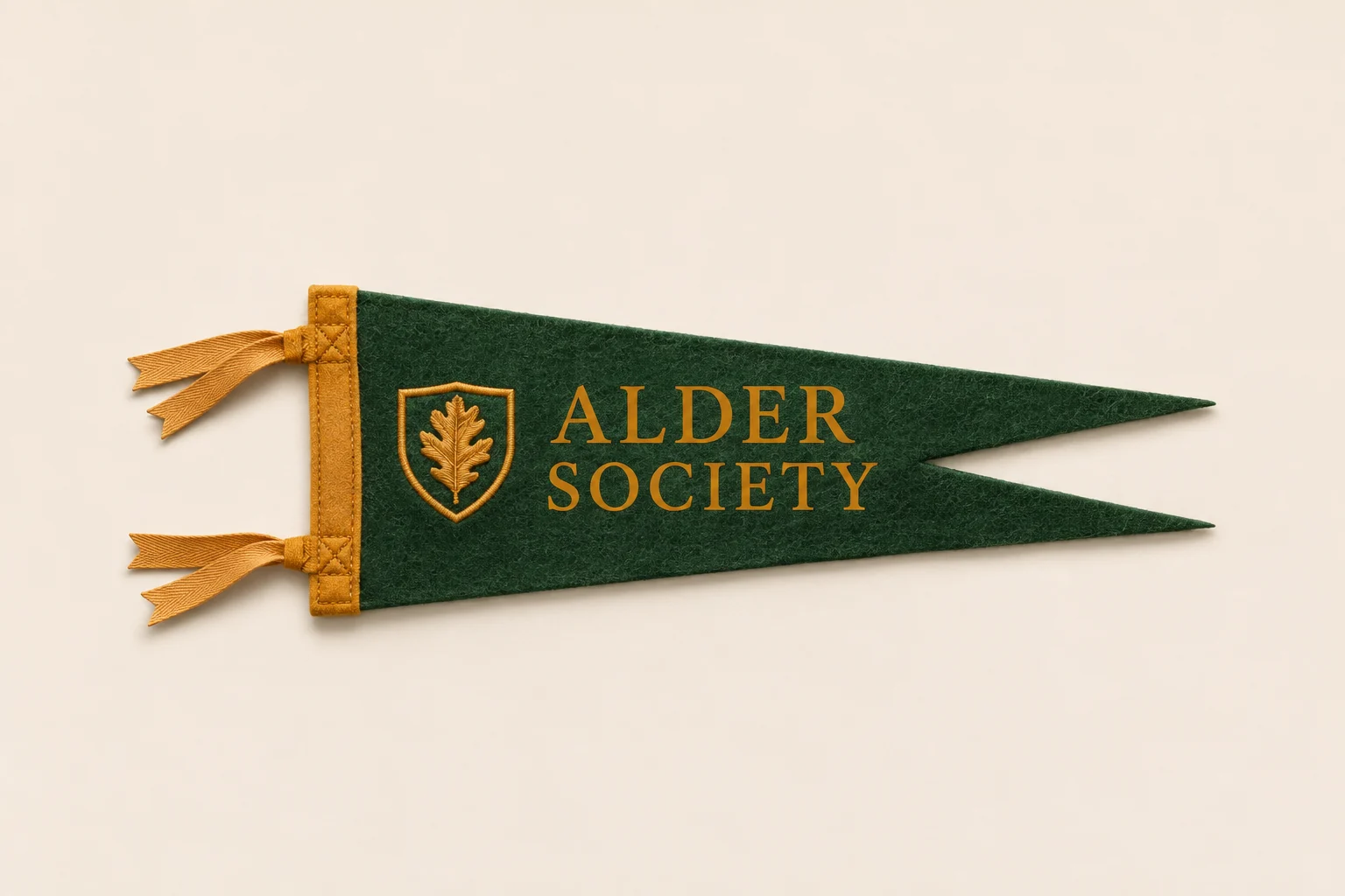
Think about the visible finish as well as the artwork. Printed ink, a separate felt layer and embroidered thread each create a different surface.
Screen print: shape and contrast.
A printed name, emblem or illustration can sit clearly against the felt. Review the actual print size, number of ink colors, felt texture and the smallest details in the design.
Applique: build the design in layers.
Cut felt letters and shapes add physical dimension. The proof should show the layer colors and placement, while the construction review covers edge stitching and the space required between elements.
Embroidery: let thread create the detail.
Stitched monograms, crests and accents can introduce texture. Fine lines and small type may need simplifying. Ask about the backing, stitch coverage and sample options for the chosen felt.
Compare at the finished size.
Artwork viewed large on a screen may look different on a mini pennant. Review the design at its intended dimensions and ask what a physical sample can demonstrate before committing to a large order.